Tableau combination chart
My Use-case
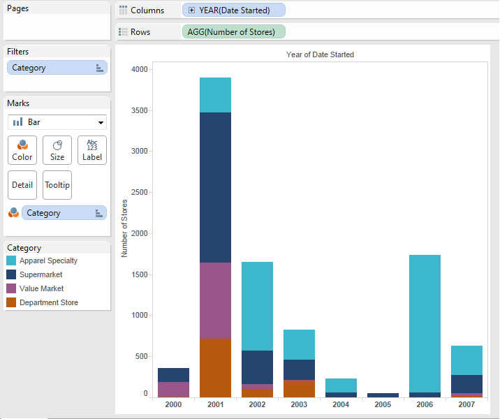
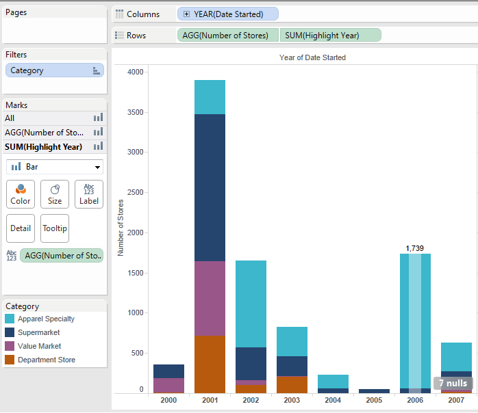
To display a chart with Number of stores across years, differentiating each year by category of the store. In addition, have an overlay that would show the total for the given year based on user selection. This should not modify the underlying chart.
Step 1:
- Create a Stacked chart
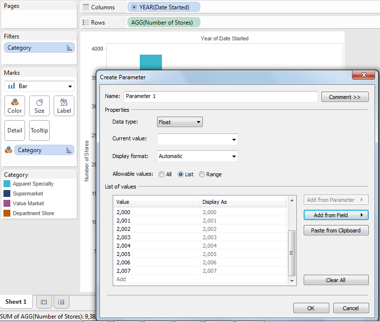
2.1. Create a parameter using Year field and select years from 2000 to 2007
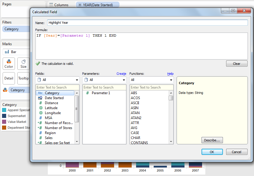
2.2. Create a calculated field Highlight Year (IF [Year]=[Parameter 1] THEN 1 END)
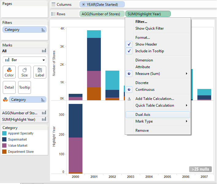
2.3. Display the parameter in the sheet and make it a slider, move the Highlight Year to rows shelf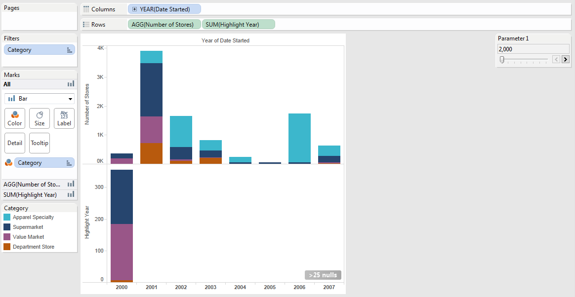
2.4. Make the Highlight Year row as a dual Axis
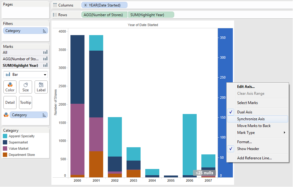
2.5. Right click on the right hand side axis and synchronize the Axis
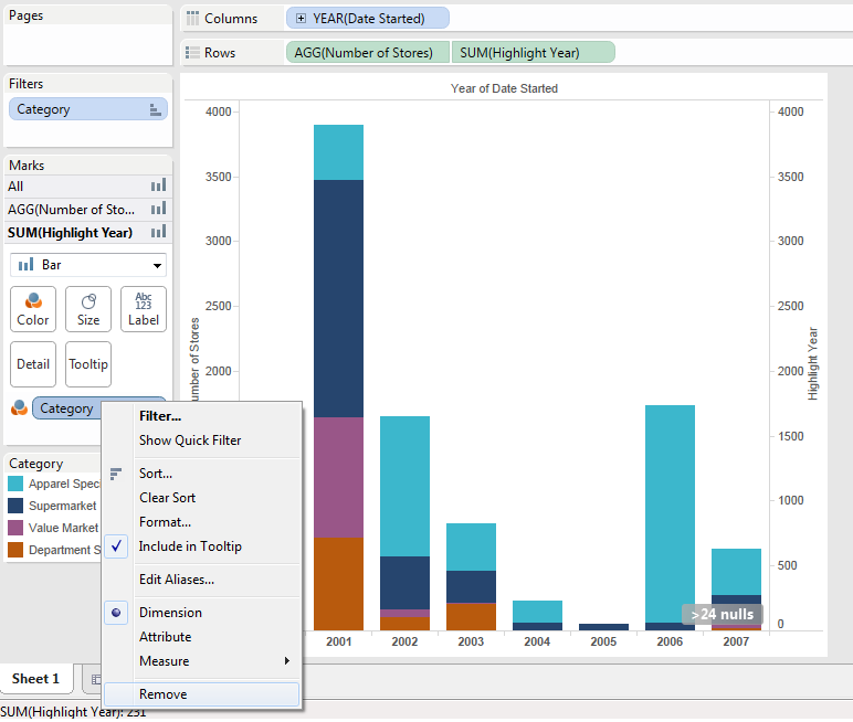
2.6.In the Sum (Highlight Year) marks; remove category from color
2.7. Change the color to white and transparency to 40%
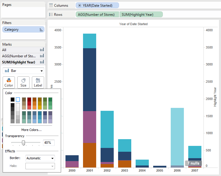
2.8. Change the size to lesser size using the slider
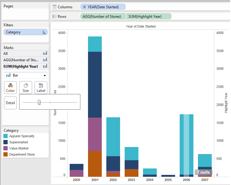
2.9. Add the number of stores to the label
Resources:
Initial tableau workbook Combination Chart (Right-click and “Save link as…”)
Original creation:
http://public.tableausoftware.com/shared/2QCDD7BPR?:display_count=no