Data Label Tricks – Tableau
Find below conditional data labels, static and dynamic approach
Conditional Data Labels
(From: http://kb.tableau.com/articles/knowledgebase/conditional-data-labels)
One way to display labels based on the values of fields is to drag a measure to Label on the Marks card. However, you might find that you do not want to label every mark; rather, only the outliers, or only the data within your region. Using calculated fields, you can create conditional data labels based on a custom field that includes only the values of interest.
This article shows how to create a conditional label that appears on a mark only when a region’s sales for a day are greater than $100,000.
Set up the initial view
Complete the following steps to set up the view for the conditional labels.
- Open a new workbook and connect to the Superstore sample.
- From the Measures pane, drag Sales to the Rows shelf.
- From the Dimensions pane, drag Order Date to the Columns shelf, and then drag Region to Columns.
- On the Order Date drop-down menu, select Day.
- Hold down the Ctrl key and drag SUM(Sales) from Rows to Label on the Marks card.
The view should look something like this:

Create a conditional calculation
These steps continue from the view you created in the previous section, to build a conditional formula that describes which marks in the view to label.
Step 1
Select Analysis > Create Calculated Field.
Step 2
In the Calculated Field dialog box, complete the following steps.
- For Name, type Outliers.
- In the Formula box, build the following formula:
IF SUM([Sales])> 100000 THEN

SUM([Sales])

ELSE null END
- Confirm that the status message indicates that the formula is valid, and then click OK.
Step 3
From the Measures pane, drag Outliers to Label on the Marks card, replacing Sales.
Step 4
If necessary, format the numbers as currency.

The view now includes labels only where sales are greater than $100,000.
Tip: You can show or hide the labels for individual marks. To hide a specific data label, right-click the mark and select Mark Label > Never Show.
Conditional Data Labels – using Parameters
(From: http://vizwiz.blogspot.com/2011/11/tableau-tip-adding-dynamic-top-x-labels.html)
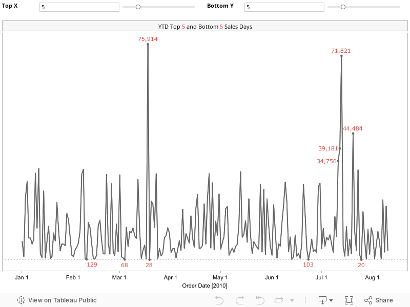
There a good chance you’ve run into this scenario before, maybe in a past life in Excel or with Tableau: You have a chart with a bunch of bars or columns or maybe a line chart, and you want the top 5 values labeled. Ideally, the chart would look something like this:

With Tableau, you can manually assign labels to these points, but wouldn’t it be better for the points that are labeled to change dynamically based on the data you have selected? There’s no easy way to do this in Tableau, but as always, there’s a workaround that’s quite simple once you implement it once or twice.
Be patient as you read your way through this; it might seem a bit complicated, but I’ll detail every step. Let’s get started.
1. Drag the Order Date dimension onto the Columns shelf, right-click on the pill and choose All Values (This changes the Order Date field from a Discrete dimension to Continuous; not a critical step, simply personal preference)

2. Drag the Sales measure onto the Rows shelf (I’ve filtered the Order Date to 2010 only, but that’s not necessary either)

3. Create a parameter, I named mine Top X, with the following properties:

NOTE: I could have chosen to always label the top 5 or top 10 values, but I want the consumers of the dashboard to be able to select the number of values they want to see labeled, thus the need for a parameter.
4. Right-click on the “Top X” parameter and choose “Create Calculated Field…” Name the field “Top X Label” and enter this formula:
IF INDEX()<=[Top X] THEN SUM([Sales]) END
I’ll explain the need to use the INDEX function in a bit.
5. Right-click on the “Top X” parameter and choose “Show Parameter Control”
6. Drag the Top X Label calculated field (from step 4) onto the Label shelf on the Marks card.

7. Here comes the trick: Right-click on the Top X Label measure and choose “Edit Table Calculation”

8. In the Table Calculation dialog box, change the Compute Using option to Advanced

9. In the Advanced window, change the Order Along settings to the Sum of Sales Descending. This will force the Top X Label field to index the values based on Sales from highest to lowest (thus the reason the calculated field compares to the INDEX() function).

That’s it! The top 5 points are now labeled. You’re chart should look like this:

You can use the Top X parameter to pick the number of values you want to label. Even if you filter the data, maybe to only show the East Region, the labels will still work properly.
But this is Tableau, so let’s take it a step farther. Maybe you need to label the top 5 and the bottom 5. There’s a neat little way to do this too.
1. Duplicate the Top X parameter and rename it Bottom Y and the show the Bottom Y parameter control
2. Duplicate the Top X Label calculated field, update it to reference the Bottom Y parameter and rename it to Bottom Y label:
IF INDEX()<=[Bottom Y] THEN SUM([Sales]) END
So now what? There’s no way to add a second label! True, but there IS a way to add a secondary axis.
3. Drag Sales onto the Rows shelf, right-click on it and choose Dual Axis

4. Remove “Measure Names” from the color shelf (we don’t need different colors since we’re using the same measure twice)

5. On the Marks card, click on the carrot on the upper-right of the card and choose Multiple Mark Types

6. Click the right arrow twice until you see “SUM(Sales) (2)”, then drag the Bottom Y Labels calculated field onto the Label shelf

7. Right-click on the Bottom Y Labels field, choose Edit Table Calculation, then repeat steps 8 & 9 above. The only difference is that the advanced table calculation should be in ascending order for the Bottom Y Labels:

You’re done! You now have an interactive chart that allows the user to pick the number of top and bottom values they want to see. Interact with it, download it and see how it works for yourself.
https://public.tableau.com/views/TopXBottomY_0/TopXBottomY?:embed=y&:display_count=yes&:showTabs=y