Creating a Donut chart in Tableau
Use-case
Steps for recreating the Donut chart example shared in Tableau community site.
http://community.tableausoftware.com/docs/DOC-5511
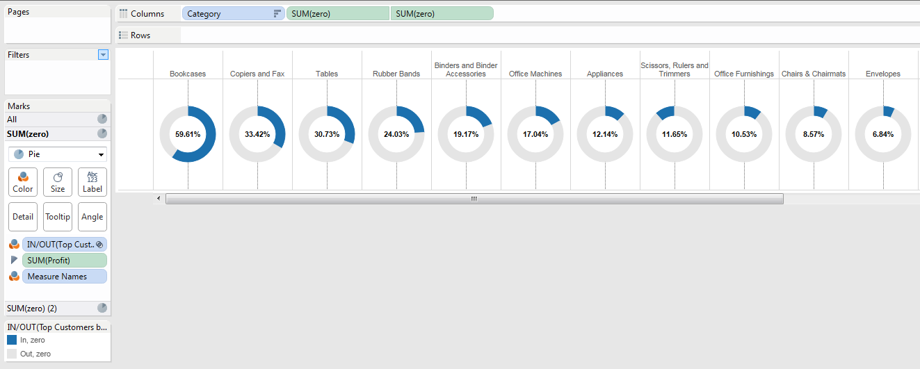
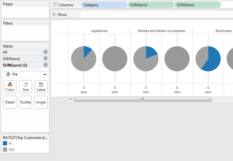
A donut chart representing the percentage of top customers by profit across product categories
Steps
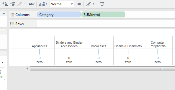
1. Create a new Tableau workbook and connect to “Sample – Superstore – English (Extract) data source
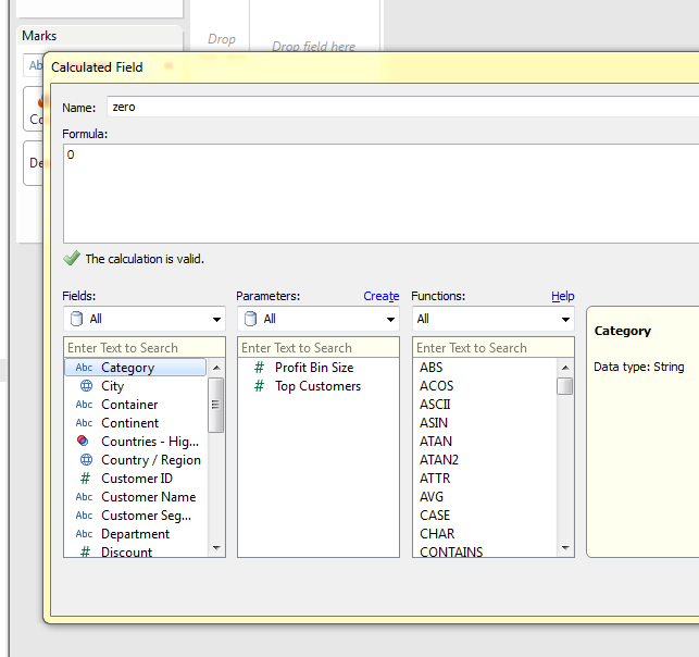
2. Created a Calculated field “zero” with value 0
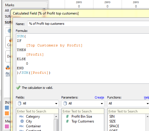
3. Create a calculated “% of Profit top customers” “Top customers by Profit” Sets is used with measure “Profit”
SUM(
 IF
 [Top Customers by Profit]
 THEN
 [Profit]
 ELSE
 0
 END
 )/SUM([Profit])
4. Drag the dimension “Category” and measure “zero” (calculated field we just created) to the column shelf
5. Make “Top customers by Profit” sets as COLOR mark and select PIE chart under the drop down
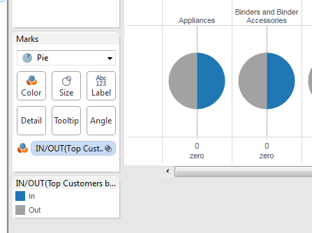
6. Make SUM(Profit) the angle marks
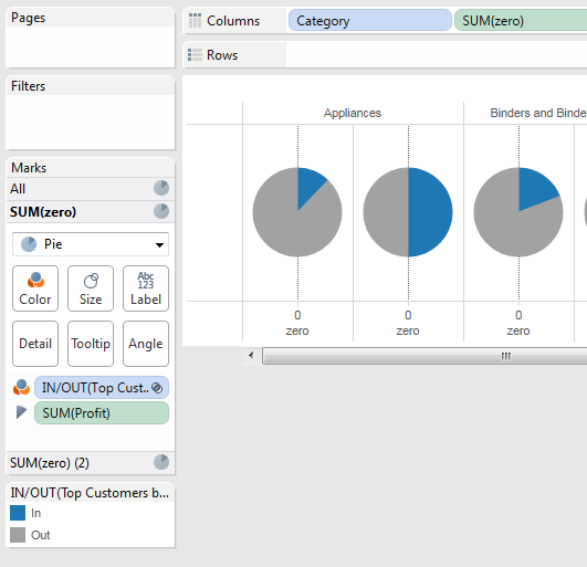
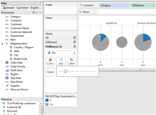
7. Add “zero” measure again to the column shelf
8. Remove all the marks from the SUM(Zero) (2) Marks selection
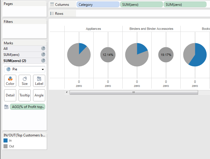
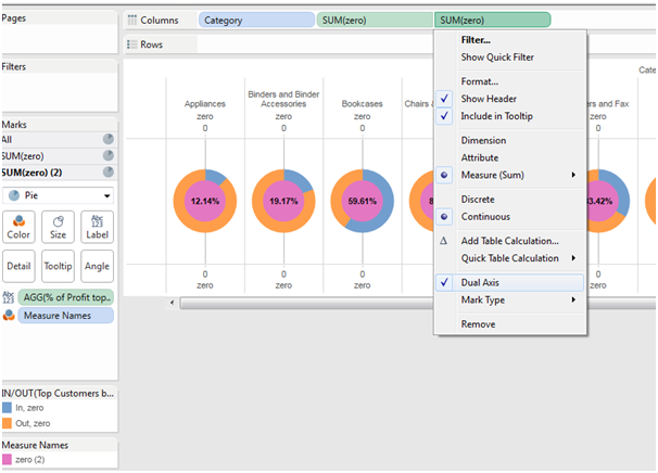
9. Reduce the size of the marks in SUM(Zero) (2) add “% of Profit top customers” as label and make the second sum(zero)(2) as dual axis
add “% of Profit top customers”
Dual axis selection
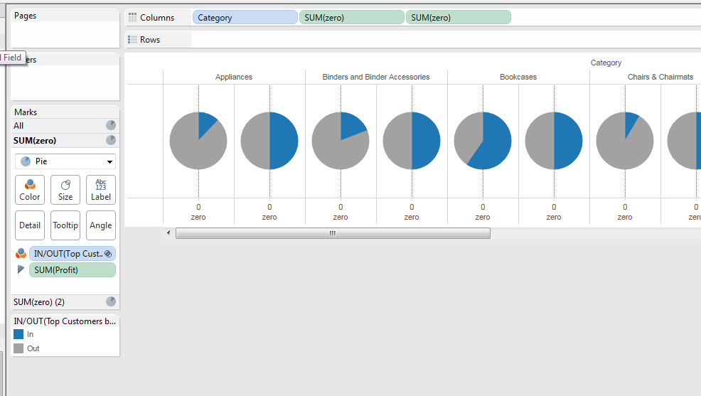
10. Format the colors accordingly and remove the headers